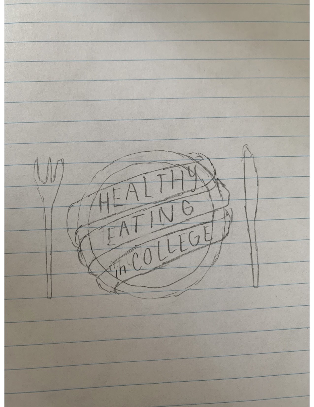
Creating a blog on healthy eating in college, I knew I wanted a logo that emphasized eating food. Since there are an abundance of healthy foods out there – picking one would be too hard. Veggies, fruits, proteins, grains. Which one would I pick to design my logo around?
My inspiration ended up coming from Pinterest. I looked at a few food logos, realizing the food shouldn’t be my main focus. You can make any healthy snack. You can make any healthy meal. Some people don’t eat meat. Some can’t consume dairy. Some live a vegan lifestyle. It was difficult for me to come up with something that was appealing to everyone.
One thing that is a universal concept for everyone who eats food is that you need a plate and some sort of utensils. Some sort of item to consume your food on. The best way to relate to my audience would be through making a logo they connect to. Everyone curious about healthy eating will have access to some sort of utensils, or at least a plate. As this article states, /the more recognizable your logo is, the more successful you are.
My goal here is simplicity, some logos have too many colors and are a bit overwhelming for my liking. I want to incorporate the colors of healthy foods – greens – with pastels and whites. I also wanted to highlight some skills I learned in previous assignments. The banners, text, and circles are all features of last week’s lessons.
By creating a logo that’s appealing to look at and easily relatable, I think my logo will encourage people to check out my blog. Marketing and advertising are all about pleasing the customer. If my readers are pleased with my logo, hopefully that will translate to my blog.