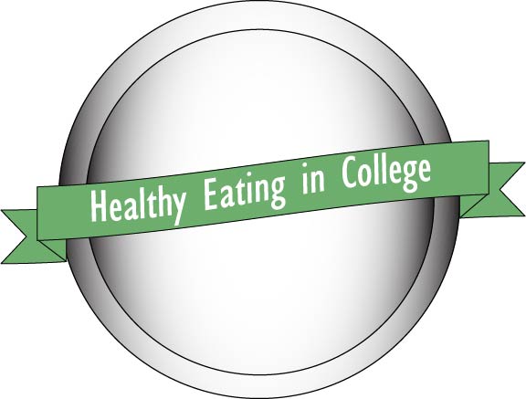
My final logo was pretty similar to the design I originally submitted. I was told and discovered that the key to a successful logo is simplicity. By using simple colors it doesn’t cause chaos. Using simple to no text makes it more appealing to the eye. By making sure the logo is completely centered allows it to look best too.
In order to best represent my healthy eating blog, using a plate as the background was the best option possible. The plate is simple in itself. I believe adding fruit or more food would turn the logo into a picture. I don’t want it to be a picture – I want it to represent my message.
The message of my blog is best represented by health and food. All of my images so far have been snacks, which is why I thought picking one snack would not best represent the entire blog. A plate represents all food, so all readers can relate to the plate. Also, by incorporating banners, it allows for the plate to not be too simple. The words also are there for better understanding.
My draft and my final logo are similar because I think the basis of my design was a smart one. Easy to look at, and not too much going on. I took out some of the banners because I realized just one could do the trick. Also, to make the reader best relate to the plate, I decided to add the gradience for it to look most realistic.
The feedback I received was helpful however not very critical. I appreciated the kind words and tips however I do wish that I could have been critiqued a bit more. This way I could really help my logo look it’s best.
After completing the logo feedback assignment I do believe that the other logos taught me how to better my own. Having a logo that is centered is crucial. It looks extremely sloppy with it even a little off centered.
After completing this logo project, my biggest goal was to make my logo look most appealing to my reader so I hope you like it!