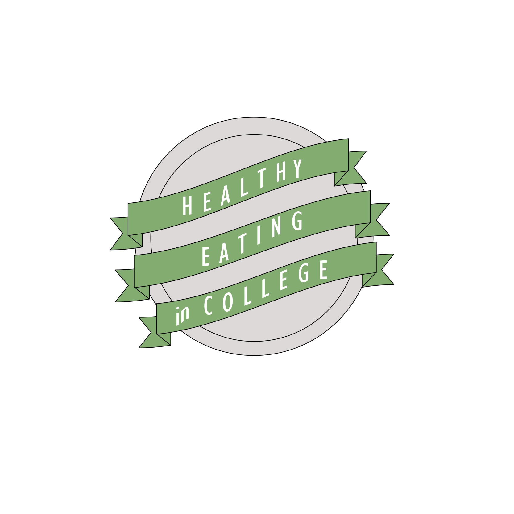
Creating a blog on healthy eating in college, I knew I wanted a logo that emphasized eating food. Since there are an abundance of healthy foods out there – picking one would be too hard. Veggies, fruits, proteins, grains. Which one would I pick to design my logo around?
My inspiration ended up coming from Pinterest. I looked at a few food logos, realizing the food shouldn’t be my main focus. You can make any healthy snack. You can make any healthy meal. Some people don’t eat meat. Some can’t consume dairy. Some live a vegan lifestyle. It was difficult for me to come up with something that was appealing to everyone.
One thing that is a universal concept for everyone who eats food is that you need a plate and some sort of utensils. Some sort of item to consume your food on. The best way to relate to my audience would be through making a logo they connect to. Everyone curious about healthy eating will have access to some sort of utensils, or at least a plate. As this article states, /the more recognizable your logo is, the more successful you are.
My goal here is simplicity, some logos have too many colors and are a bit overwhelming for my liking. I want to incorporate the colors of healthy foods – greens – with pastels and whites. I also wanted to highlight some skills I learned in previous assignments. The banners, text, and circles are all features of last week’s lessons.
By creating a logo that’s appealing to look at and easily relatable, I think my logo will encourage people to check out my blog. Marketing and advertising are all about pleasing the customer. If my readers are pleased with my logo, hopefully that will translate to my blog.
I really like the banners you created and how you placed them over a plate. One suggestion I would make is adding the fork and spoon that you drew in your sketch also instead of a white background it might look cool to have the back ground look like a place mat or something.
LikeLike
I think your idea for your logo project is a good one. I like how the topic of healthy eating in college is incorporated into the logo itself. It is a good example of what we learned during the school week. Your logo itself is also very well done as well and for as simple as it is adding too much more might make the image seem all bunched up and unattractive to the viewer. If i were to add one thing to your logo I would add something around the boarders or cope the image so it isn’t so square on the screen. Also I would add some healthy food to the logo like fruits and veggies. Another thing is adding more color, for as simple as it seems the color addition will take your logo to the next level.
LikeLike
Looking back at my logo as well as my group members logos, I think I could make a few changes to make mine a lot stronger. My background plate could be a lot more appealing to look at if I use the gradient tool. I also could make my logo a lot larger on the white background to make it stand out more. I think overall the basic-ness of mine is okay, however I might end up adding the fork and knife. My only fear is that would make it too much like a picture instead of a logo. I think through looking at my group members blog posts though, I have realized things I can change. I am proud of my text with my post however, I think I have made it most “blog-like.”
LikeLike
I think your idea for your logo project is a good one. I like how the topic of healthy eating in college is incorporated into the logo itself. It is a good example of what we learned during the school week. Your logo itself is also very well done as well and for as simple as it is adding too much more might make the image seem all bunched up and unattractive to the viewer. If i were to add one thing to your logo I would add something around the boarders or crop the image so it isn’t so square on the screen. Also I would add some healthy food to the logo like fruits and veggies. Another thing is adding more color, for as simple as it seems the color addition will take your logo to the next level.
LikeLike
Hey McKenna. I really enjoy you are taking eating healthy in dining halls very seriously. There is a serious problem in the food that they are serving and as recently becoming adults a grilled cheese everyday sounds like a good idea. This is not a good idea however. Your writing about your design made your design make a lot of sense and I do not have to question what your are creating. The plate was a good idea with the banners on top of it and thought it gets your point across. However, the bottom banner you had created looked a little awkward with the word “is” in the corner. It looks a little out of place and does not flow with the rest of the banners. As well if you were able to make the banners flow better with the plate that would be a good idea. Rather than being on top maybe making them look like part of the plate. But, overall your project rough draft is really well done and it looks really good.
LikeLike