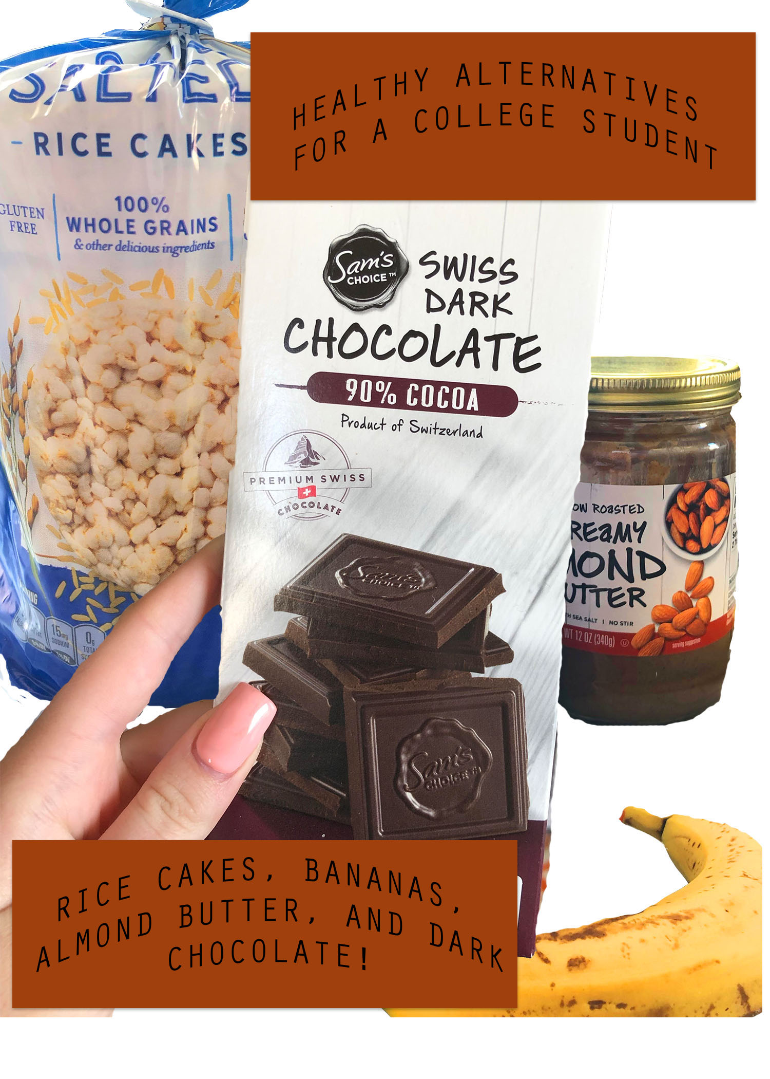
After reading over my Graphic Design Project draft feedback, I realized I failed to understand the directions. The feedback was extremely helpful though! I learned that I didn’t need three final pictures, instead just one. Also some of the text I used was too distracting. Instead of 3D letters I now plan on bolding my letters. One of my editors mentioned that the half-drunken Starbucks was a bit unappealing. I decided to leave this one out of my final project.
After reading my feedback notes I decided I was going to change the goal of my work. I hoped in this one to create the look of layering my images with the cutout and blending method. This way all of the images can mix together and still look like a poster promoting healthy eating. Since all of my images were separated before this will give off a more appealing look.
The goal of each of my photos was to make the food stand out. I wanted them to all look like posters. The inspiration stemmed from the food advertisements that make the food look delicious. Also I wanted healthy eating to be appealing for my reader.
Unfortunately, each of them separately would be no help. Shout out to my peer editors, I managed to follow the real directions. This way the food still stood out, just on a well organized photo.