
All of my images were taken on my phone, and edited on Photoshop. I think that the best way to make change is in small ways. For example – becoming healthier. It’s quiet impossible to turn a dining hall diet into a fit diet right away. However, it is possible to make small changes right away that eventually lead up to bigger ones.
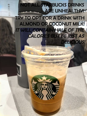
Hence my first photo. Drinking coffee in the morning is ESSENTIAL to survival in college. The calories count up day by day if you are ordering lattes and ,mochas. Buuut if you make a switch to a lighter milk, you can cut your calorie intake in half. Almond milk and coconut milk are good substitutes for whole milk.
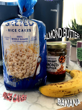
My second photo is one that captures a midday snack. Many students will get straight back in bed after class. Whether it’s napping, Netflix watching, or social media scrolling, tummies begin to growl. Instead of unconsciously eating half of a goldfish bag, it’s smarter to make a healthy, filling snack.
Almond butter is a better alternative for peanut butter, a banana will give you potassium, and rice cakes satisfy your salt cravings. Put all three together and you have a healthy afternoon snack.
The last photo is of dark chocolate and why you should eat it. Candy in college is inevitable. Dining halls, gas stations, markets, all carry it at such cheap prices. Instead of wasting calories and extra sugar, dark chocolate is the best substitute. Not only does it satisfy for your sugar craving, but it has many health benefits.
Although weird to recommend sugar on a health blog – it must be noted that dark chocolate is just an alternative. If you don’t have a sweet tooth, don’t go for the chocolate at all!
These options are here to begin the journey to being healthy, stay tuned for more updates!

First off, I love the idea of creating a blog on healthy eating for college students! I love all three of your pictures but if my understanding is correct they should all be combined into one graphic design visual using the techniques we learned on combining images in the Photoshop tutorials. Therefore, my first suggestion would be to combine all of the images. I think creating a magazine cover would be an easy way to incorporate your images, tips, and make it clear that you are focusing on healthy eating for college students. While I love what you say in the text, it isn’t very legible unfortunately. I think some of the techniques are a bit overdone, so simplifying things would help with that. The text could also use some sort of a background to create contrast so it really pops. Other than that I love what you have done, great job!
LikeLike
I like your topic and how it is relatable to everyone in this class. I think the images you chose helps visualize your topic. two things i would suggest however is to change the color of your captions to make them more readable. Also, I would something cool to do would be to have the background of your healthy food items be in more of an active or outdoors environment to help further show a healthy lifestyle.
LikeLike
I really like your idea for your post of using a place that we are all familiar with (Starbucks) and giving a healthy option rather then the normal high fructose corn syrup drinks that we are used to. If I were to change anything I would use a font that doest blend in with the background picture as much as the one you chose. Using a more vibrant font would make the text pop out more and allow for the reader to understand it easier. Also using a full Starbucks drink would be more appealing to the view rather then a half drank cup.
LikeLike
After looking over everyone else’s comments on my post I realized that I may have completed this the wrong way! I thought I was supposed to create an image design for each of my photos, however I now know that I should’ve combined them all into one! I definitely think I am going to take the poster route, and put my images together in order to create one big healthy eating poster. I also want to not use the 3D letters because although they were cool to figure out, they were hard to read on my picture. I appreciate my group being honest because there were also a lot I didn’t even think about when taking my photos. For example, using a picture of half of a Starbucks drink was a bad idea because it was not aesthetically pleasing.
LikeLike